This December has been full of surprises, and the snowstorm that walloped us last week was only one of them. Pantone, the world’s leading authority on color, shocked designers, manufacturers, retailers, and consumers alike with its announcement for the Color of the Year 2016. Its decision has everyone guessing at the social and political implications, and it’s sure to splash some serious intrigue into next year’s designs.
A Real Surprise
Pantone announced that the Color of the Year 2016 would be, not just one, but TWO colors: Serenity and Rose Quartz. Never before has a color duo been selected to share the honor, and the news has caused quite a stir. Perhaps more surprising than picking two colors is the fact that the colors themselves are pastels and opposites. Serenity is a “baby blue” color, and Rose Quartz is like “baby pink”. With the stresses and chaos of modern life, this seems an odd pair to fit with the zeitgeist of the times. Maybe, though, that’s the point. A throw-back to the innocence and simplicity of childhood, the colors can bring a sense of relaxation, peace, and order into our crazy lives.
What Can I Do With Them?

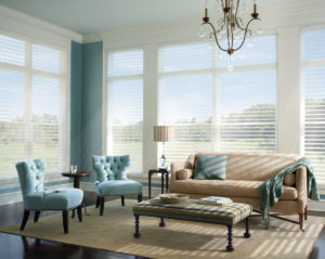
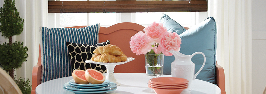
Use one, use both. Sprinkle in a little, cover the room with a lot. The ways to incorporate Pantone’s Color of the Year pairing into your interior spaces are endless. While many might be put off by the traditional view of these colors as “baby” blue and pink, Serenity and Rose Quartz make a stunningly mature statement. They add a sense of soothing relaxation while also appearing elegant and upscale. When used alone, each offers its own beauty in a way that captivates. And, when joined together, they create a harmonious look that is beyond gorgeous. So, however you want to do it, try refreshing your home with 2016’s Color of the Year duo. We know you’ll be amazed at the results!
Get Inspired!
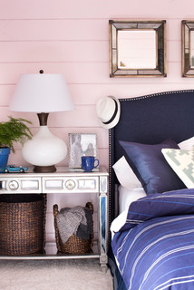
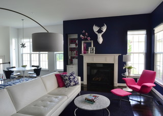
Every year, Pantone’s choice for Color of the Year inspires designers around the world. They put their own spin on the color, or what it represents, and that makes their work unique. Why not do the same? No one is stopping you from taking cues from 2016’s predicted color trend to do something extraordinary. Instead of using the soft shades that Pantone chose, go bold. Dark blue and hot pink are a fabulously alluring combination that will really make an impression! You could also adopt the concept of using contrast to create harmony with other colors that speak to you. Be inspired, and let your imagination lead you!
Here at Rocky Mountain Shutters & Shades, we can’t wait to be surprised by how Pantone’s Color of the Year influences fashion and interior design in 2016. We also can’t wait to hear from you. Whether you’re looking for ways to incorporate Serenity and Rose Quartz into your home, to get inspired by them, or to start a project for the new year, we’re here to help! You can count on our design experts to give you solid advice and show you options for window coverings that’ll be the perfect backdrop for whatever you’re imagining. Contact our team for a free, in-home consultation.


